In order to change color settings navigate to KSF SmartKit > Theme options > Styles and colors.
In this section you can adjust brand, body background, links, and lightbox overlay colors.
You can choose links style: underlined, underlined on hover, without underline.
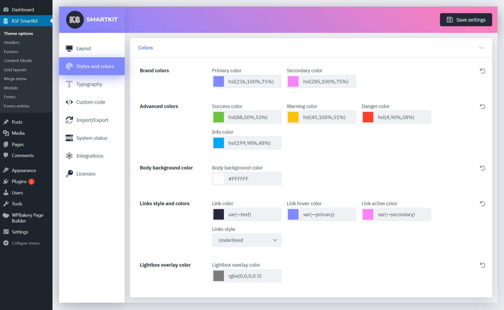
Color picker supports hexadecimal, HSL and HSLA formats as well as CSS custom properties.
Available CSS custom properties
Basic brand colors
var(--primary) — primary color from theme settingsvar(--primary-dark) — darken than primary colorvar(--secondary) — secondary color from theme settingsvar(--secondary-dark) — darken than secondary color
Body and links colors
var(--text) — body typography color from theme settingsvar(--link) — link color from theme settingsvar(--link-hover) — hovered link color from theme settingsvar(--link-active) — active link color from theme settings
Advanced colors
var(--success)var(--warning)var(--danger)var(--info)
Primary-based colors
var(--light)var(--light2)var(--light3)var(--middle)var(--middle2)var(--middle3)var(--dark)var(--dark2)var(--dark3)
If you set the basic colors in the theme settings, the palette of additional colors will automatically adjust to the basic colors.
Colors settings can be applied both globally and for individual components, most of which also support gradients.